WSJ Member Messaging
PROBLEM
Member marketing placements on WSJ.com were causing a lot of complaints from our customers, however analytics indicate that they are performing well—largely due to their prominent placement at the top of the page.
GOAL
Provide a better experience for our customers that also allows editors and marketing to communicate to members in meaningful and effective ways.
METHODOLOGY
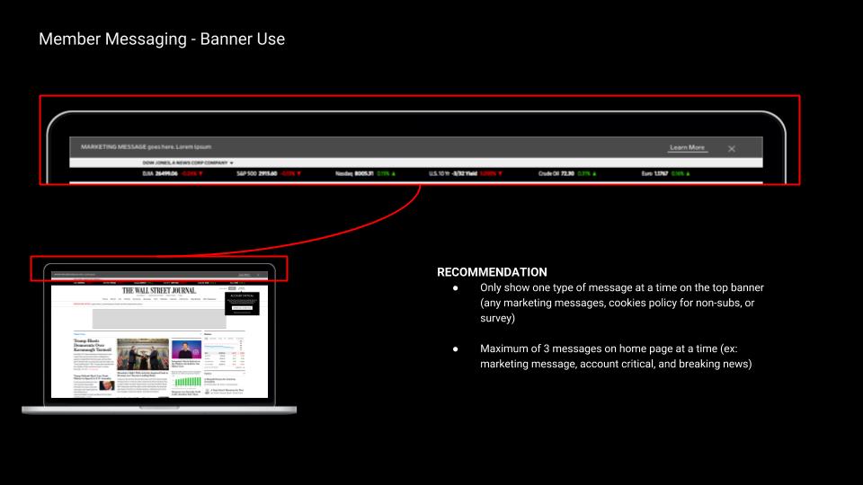
I analyzed the current member messaging placements in conjunction with the customer complaints to determine where the areas of friction and opportunities for improvement were. I worked with the UX intern closely to perform competitive research to see how other companies were tackling this issue. The biggest insights we found from this was that there were overall too many messages directed to our members that looked like ads. We want them to feel like valued members, not like we are spamming them. We also want to communicate valuable offerings we have that they aren’t taking advantage of on site.
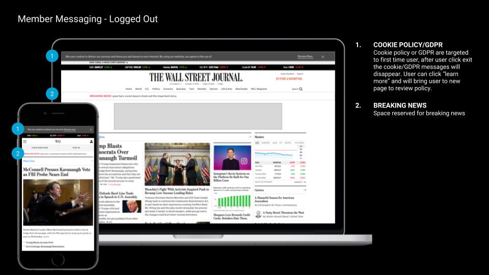
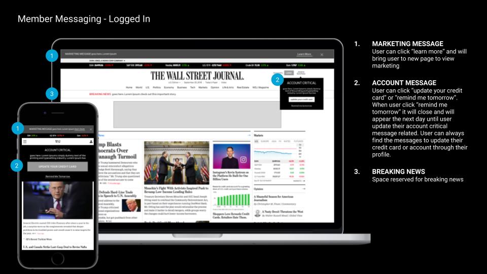
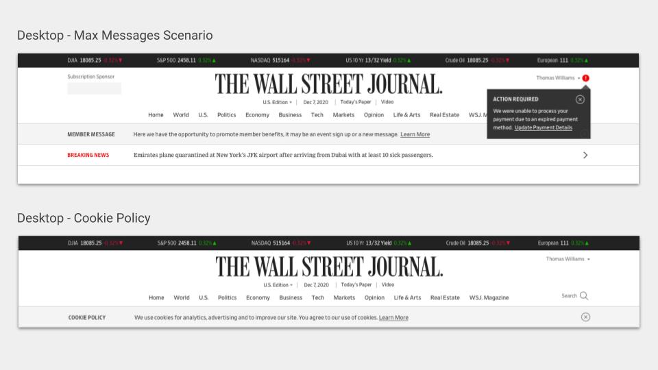
We started by categorizing all the different types of messages we are giving to users, and then designed placements appropriate for each category. Prior to this, we were using the same big banner at the top of the page for everything.
SOLUTION
We created a design system with rules about what types of messages to send, where, how, and when. You can see the proposed wireframe solutions and final designs on the left. The first member marketing message went live on 12/6. We saw 100 newsletter signs per hour, and had no customer complaints!


