WSJ New Home Page Concept
PROBLEM
We had a design sprint to solve the following problem – WSJ members have low awareness of the value of their WSJ membership.
GOAL
We wanted to design something that would make the value of WSJ more relevant and easier to discover for our members. My concept detailed below was the winning sprint design concept.
METHODOLOGY
We did a 2 day design sprint to come up with concepts and voted on the final one. My concept one and was going to be baked into the new WSJ home page redesign research plan. My role was coming up with the concept and initial sketches. I then collaborated with the Visual Designer, Cory Etzkorn, to create the prototype. He did the final visual designs you will find in the live prototype.
SOLUTION
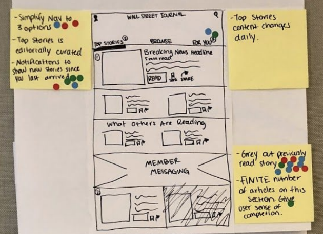
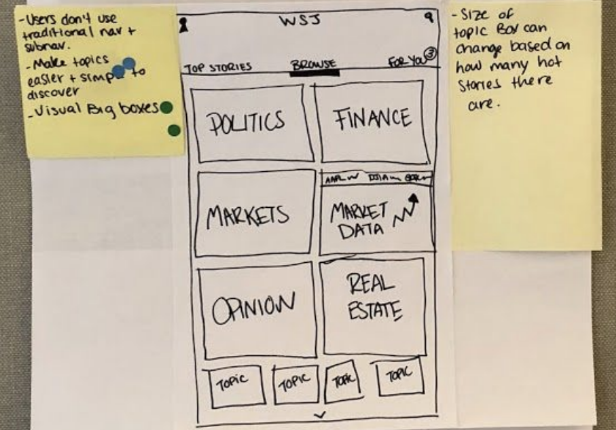
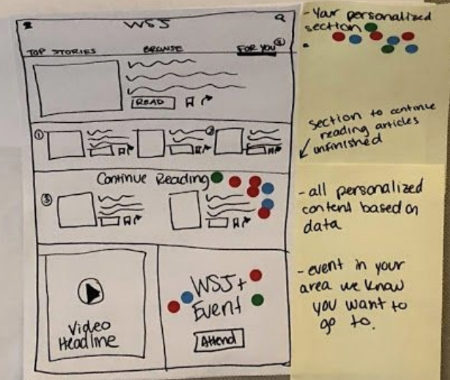
A simpler, more modern, and personalized WSJ system. I stripped the top navigation down to 3 tabs: Top Stories, Browse, and For You. The Top Stories section is the editorially curated home page. We had heard complaints from our members via our customer service team that the desktop homepage feels overwhelming. Therefor, I created a home page with less content and more hierarchy. The Browse section had visual categories for different article topics which I hoped would make navigating through our content easier than the currently cluttered top navigation. The For You section is the member’s completely personalized section of WSJ, where the member could see content he/she has selected to hear more of, and recommended content. The goal of my solution was to make finding relevant content easier through a more enjoyable navigation experience.


