WSJ Market Data Section
PROBLEM
We had a seriously old looking WSJ Market data section. I’m talking champagne colors, double navigation with bullet points that doesn’t match the rest of the site. It probably hadn’t been updated since the early 2000s. We wanted to redesign the WSJ Market Data section to make it more modern looking, and also make it easier to get the market data “snapshot” that you need.
GOAL
We know WSJ members mostly come to WSJ for news. They view market data as a secondary product that at times amplifies the news. The majority of our members come to WSJ Market Data to get an overview of what’s going on in the market data world. Our goal was to design the market data section that serves the main use case of providing a great overview, while allowing super users to drill into specific market data content. We also wanted to incorporate more related news with the data to better tell the stories of the markets.
METHODOLOGY
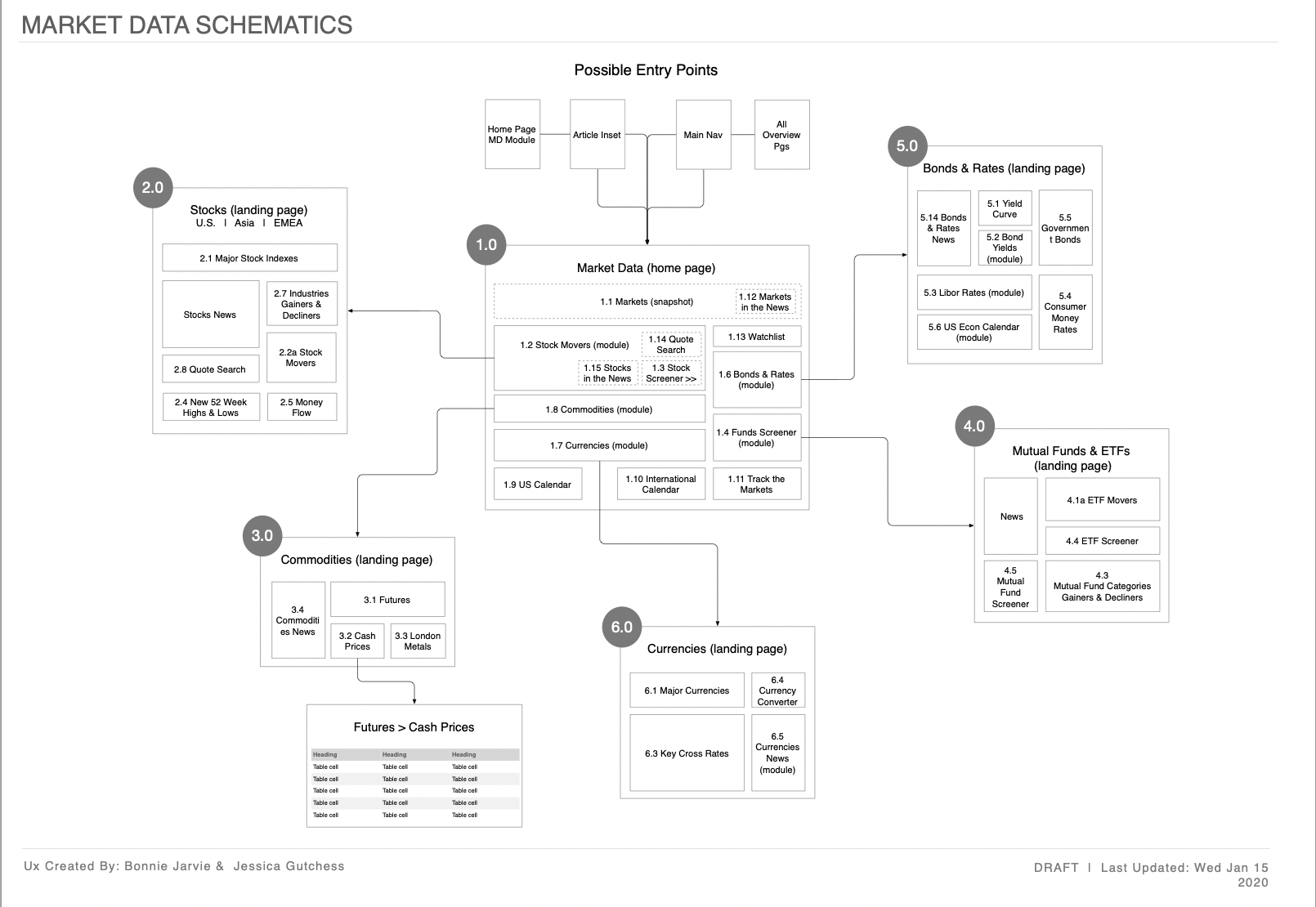
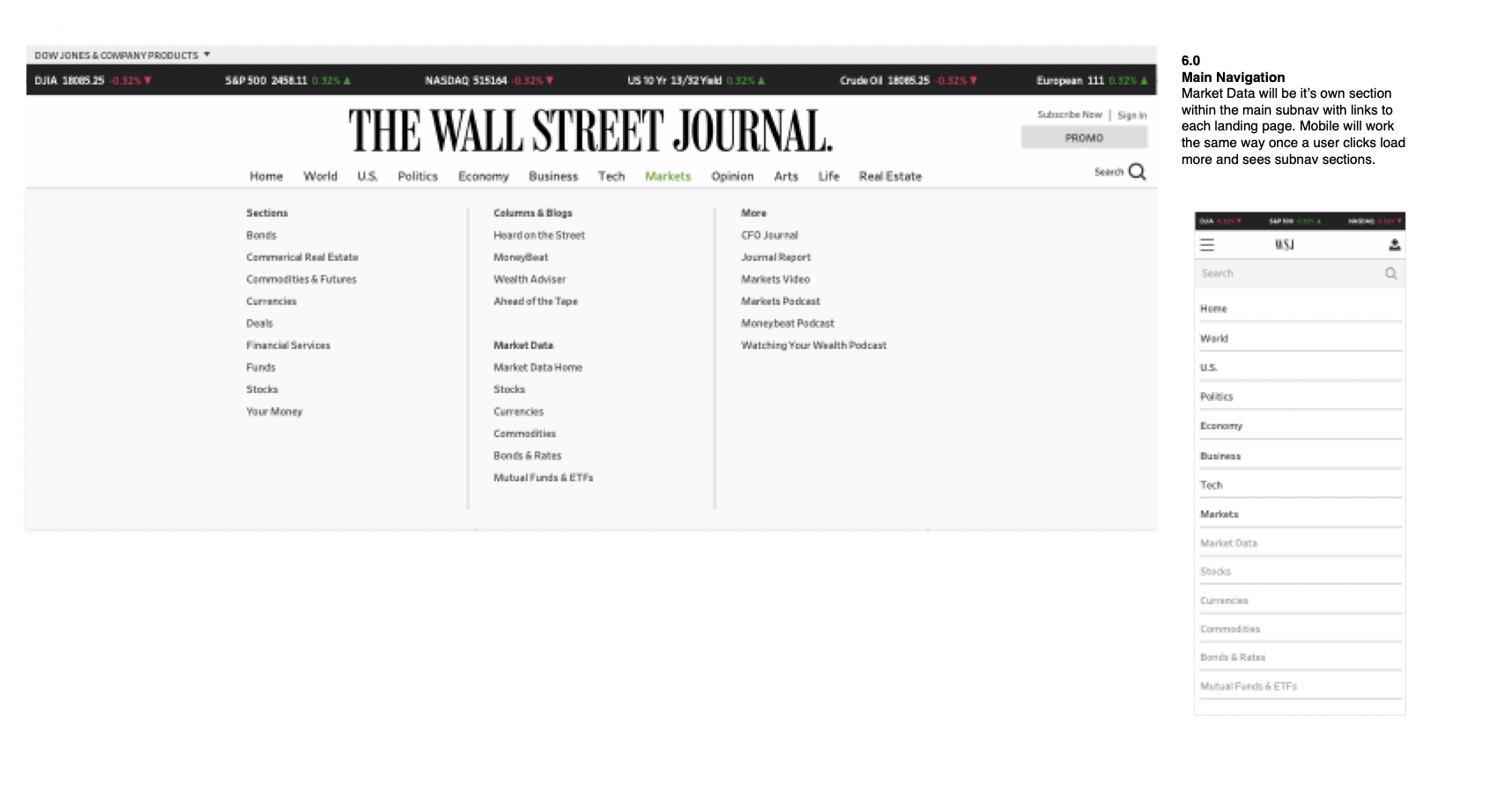
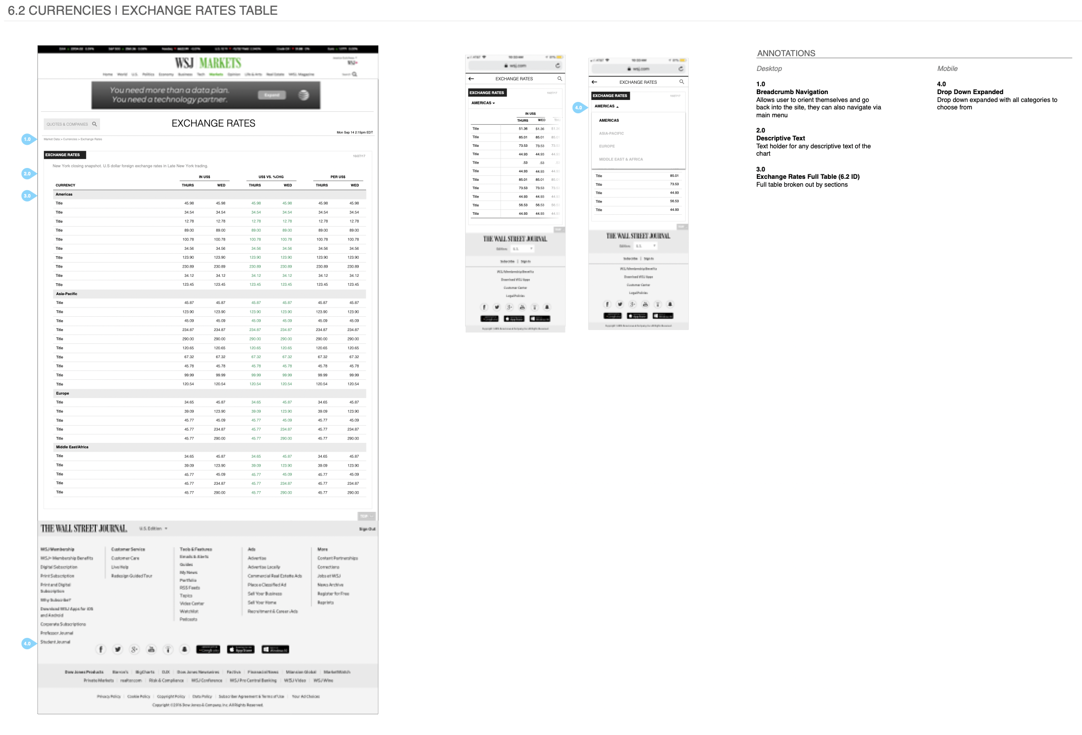
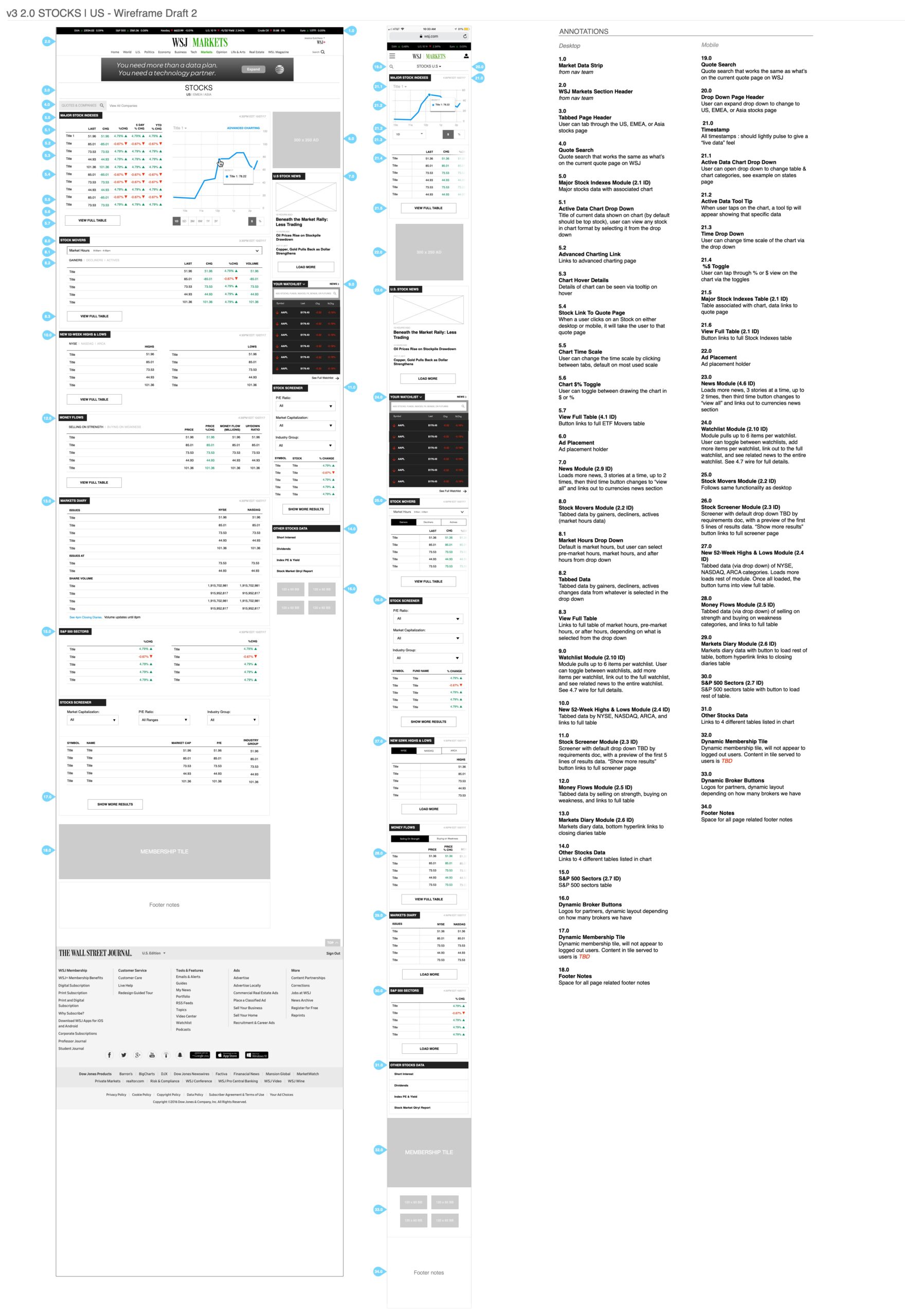
I collaborated with the VP of UX who had already done the research for the project at the time, and then kicked the project off to me. I had clear directives from the research and the product manager that explained our goal. I worked closely with the market data editor to make sure I included all of the content we needed. My role was to design the IA, schematics, flows, and wireframes. I then worked with the visual designer to make the final designs. I only included a few wireframes here as examples, as there are many, but would be happy to show them all in person.
SOLUTION
A streamlined, easier to digest, easier to find, modern market data section. See the live section here.


